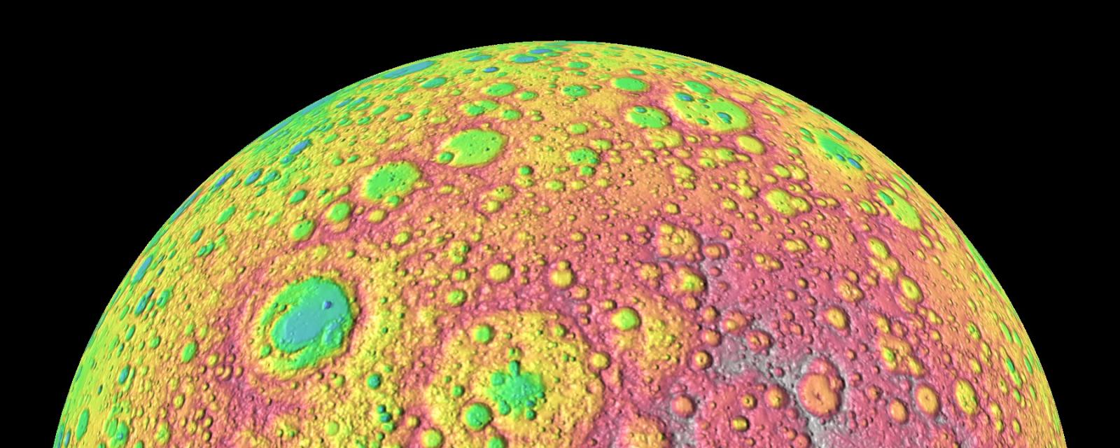
What’s with the colorful images?
Scientists use representational color in images to highlight many different types of data collected by NASA satellites and spacecraft.
Elevation—NASA’s Dawn spacecraft collected data about the surface features of Ceres, a minor planet in the asteroid belt between Mars and Jupiter. Reds shows high elevation and purples show low ones.
Ice Flow—Scientists processed NASA satellite data to show natural ice flow in Antarctica over time. Ice flows from the center to the edges of the continent. Faster ice flow is shown in reds and purples.
Carbon Dioxide Levels—Scientists using a NASA supercomputer model simulate how the greenhouse gas carbon dioxide travels through Earth’s atmosphere over the course of a year. Reds are higher concentrations of the greenhouse gas, and blues are less. Clear patterns emerge, such as higher concentrations of carbon dioxide in the more industrialized northern hemisphere, and seasonal decreases due to the growth of carbon dioxide-absorbing plants in the spring and summer months.
Video and Image Credits:
Elevation: NASA/JPL-Caltech/UCLA/MPS/DLR/IDA/PSI
Ice Flow: : NASA/JPL-Caltech/UCI/Goddard Scientific Visualization Studio
Carbon Dioxide: NASA's Goddard Space Flight Center
Descriptive text adapted from NASA/JPL-Caltech and NASA's Scientific Visualization Studio
